Freelance project for a massage therapy company called MyoPhysio.
The Client
MyoPhysio is a small Massage Therapy company operating in Austin, TX. They specialize in rehabilitation procedures. "MyoPhysio" is a play on the Spanish words Myo and Physio. Which said together sounds like “Mi oficio".
THE BRIEF
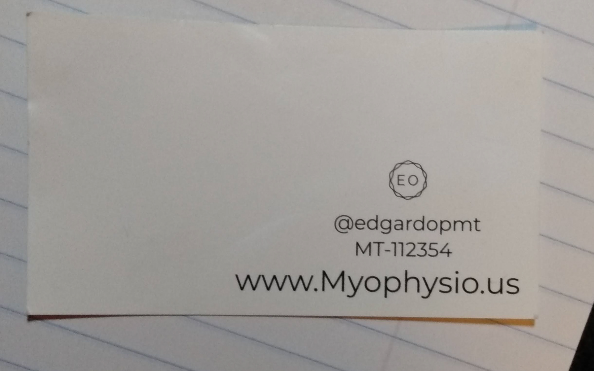
The original business card was very minimal, which is okay, but it was missing a lot of crucial elements like contact info; it doesn’t convey any info about what MyoPhysio does.
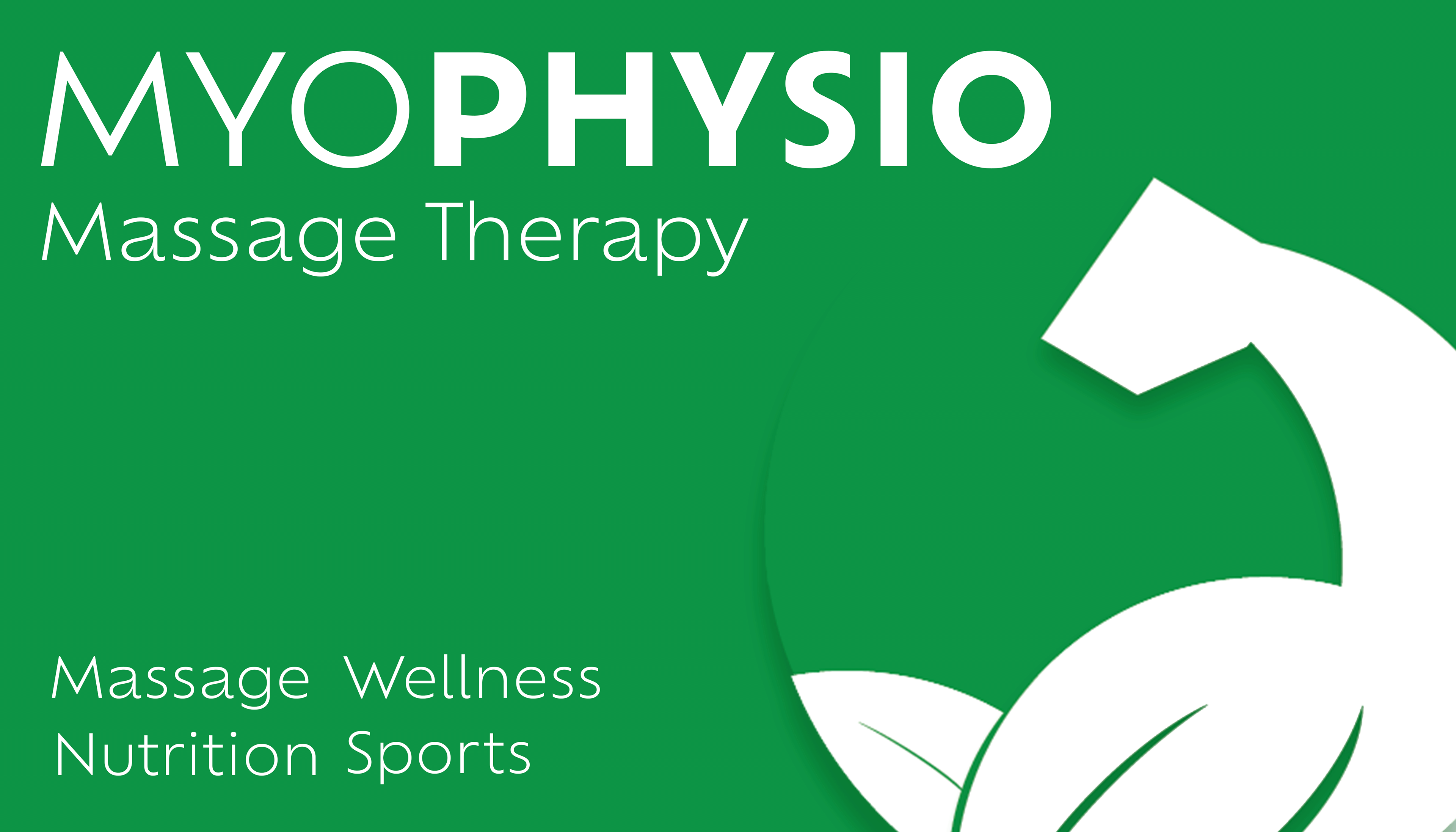
My objective for this design is to inform viewers of the services the client provides and contact info, as well as a logo that makes the brand more cohesive and professional.
I want to help my client expand their business with this design so they can get more clients themselves.
Designing the Logo
Upon reading the word “muscles,” an image of an arm sprung into my mind, and the word “nature” made me think of leaves and the color green, so after some sketching, I could conjure up a design I liked that combined both elements.
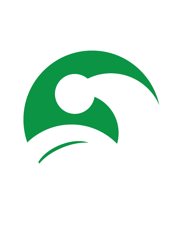


I decided to use the leaves are a bicep for the arm, which symbolizes nature, strength, and regrowth. All of these apply to MyoPhysio's business goal.
The first two logo drafts were unclear - the first resembled a hat, and the second could be misread as a dinosaur.

In the end, I carved out the shape of the hand more using the pen tool and looked at some anatomical references for the forearm.
Brainstorming the Cards
My first designs didn’t have a logo because I was mostly focused on laying out the information, and I used the lotus as a placeholder.
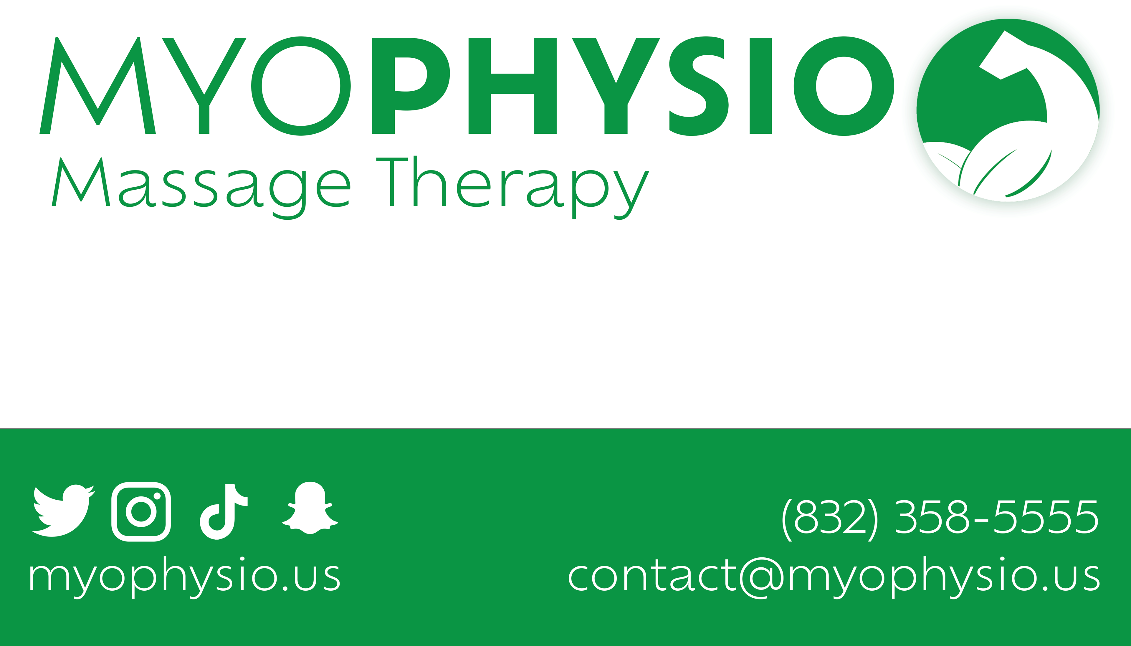
I then added a blue bar to take care of the negative space and listed the client's services, contact info, and social media.


I later changed the color to green to match the logo, and I decided to dedicate the front to showing the logo and services and the back to the contact information.
DELIVER


Impact
My designs allowed MyoPhysio to have more professional branding so they could make a good first impression with potential clients at networking events.